![]()
I’ve made no secret of my personal disdain for Presentation Levels. My non-appreciation for presentation levels is largely driven by presentation evaluation complaints received over the years. These complaints mostly read the same (paraphrased): “The presentation was advertised as Level 200, but I felt it was more of a Level 100 (or 300, or whatever) presentation.”
I have three kneejerk reactions to this complaint:
- Levels are subjective and imprecise.
- Your Level 100 (or 300, or whatever) is probably different than someone else’s Level 100 (or 300, or whatever). Or mine.
- I’ve neither attended nor delivered a presentation at a single level.
I’d rather see something – anything – more than an naked scalar.
One Solution
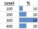
I propose a more realistic reflection of presentation content. We don’t have to use data bars like the image shown below, but some indication of how much content is at which level would more effectively and accurately reflect the content of a presentation. If we insist on naked scalar levels, we could pick the largest percentage and label the presentation thus.
But I’d rather see something – anything – more than an naked scalar. I’d rather see something like this which I call Tiered Levels:

Applied
Tiered Levels address point 1 (somewhat) above. While still subjective, there’s more precision.
Tiered Levels do nothing for differences in skill levels of attendees or differences between attendee skill levels and the skill level of the presenter.
Tiered Levels completely address the fact that naked scalar presentation levels are less accurate while adding visibility into the true level distribution of the presentation.
:{>

Comments