
 I’ve shared suggestions for improving presentation categories:
My chief concern is the scalar nature of the selections (the “Naked Scalar”). As I pointed out in both posts, I’ve been delivering presentations to the SQL Server Community for more than a decade and I’ve never – not even once – delivered a presentation that was strictly Beginner, Intermediate, or Advanced; or Level 100, 200, 300, 400, or 500.
It’s a mix. Every. Single. Time.
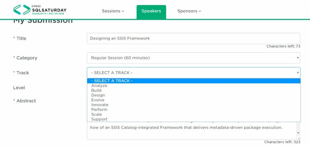
PASS Tracks
That said, I really like the definitions for PASS Tracks. Click that link and read through them. PASS did a good job distinguishing different types of helpful presentations and defining tracks.
As a data person, I get the logic behind the scalar values. Scalars are easier to store and way easier to search.
My post about presentation levels was inspired more by feedback from attendees who shared they thought my session level was incorrect – that it should have been higher or lower (I’ve actually received both complaints – that the session level was advertised as too high and too low for the same delivery of the same presentation…).
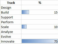
As an engineer, I’d like more accuracy:
But…
I’m not sure sharing more accurately would improve the conference attendee experience. Sharing more than a scalar – at least like the chart above – would increase the costs of printed material. It would require more engagement on the part of the attendee and more detail – and management – on the part of the presenter. Why management? My presentations evolve over time (I like to think they get better but I am biased…)
Would it be worth the investment? I think probably not.
So, while I continue to loathe the Naked Scalar wherever I encounter it, perhaps a scalar is the best solution after all.
I will continue to place these charts in my presentations and share them at the beginning of my session, in case someone thinks the presentation will cover more of one topic they wish to learn about. In this way, people have enough information – early enough in the presentation – to vote with their feet and attend a different presentation.
:{>
Comments